Infographics have become a popular form of visual communication due to their ability to present information in a condensed and highly visual way. However, not all infographics are created equal.
To ensure your infographic is effective and engaging, here are the top essential design tips to keep in mind.

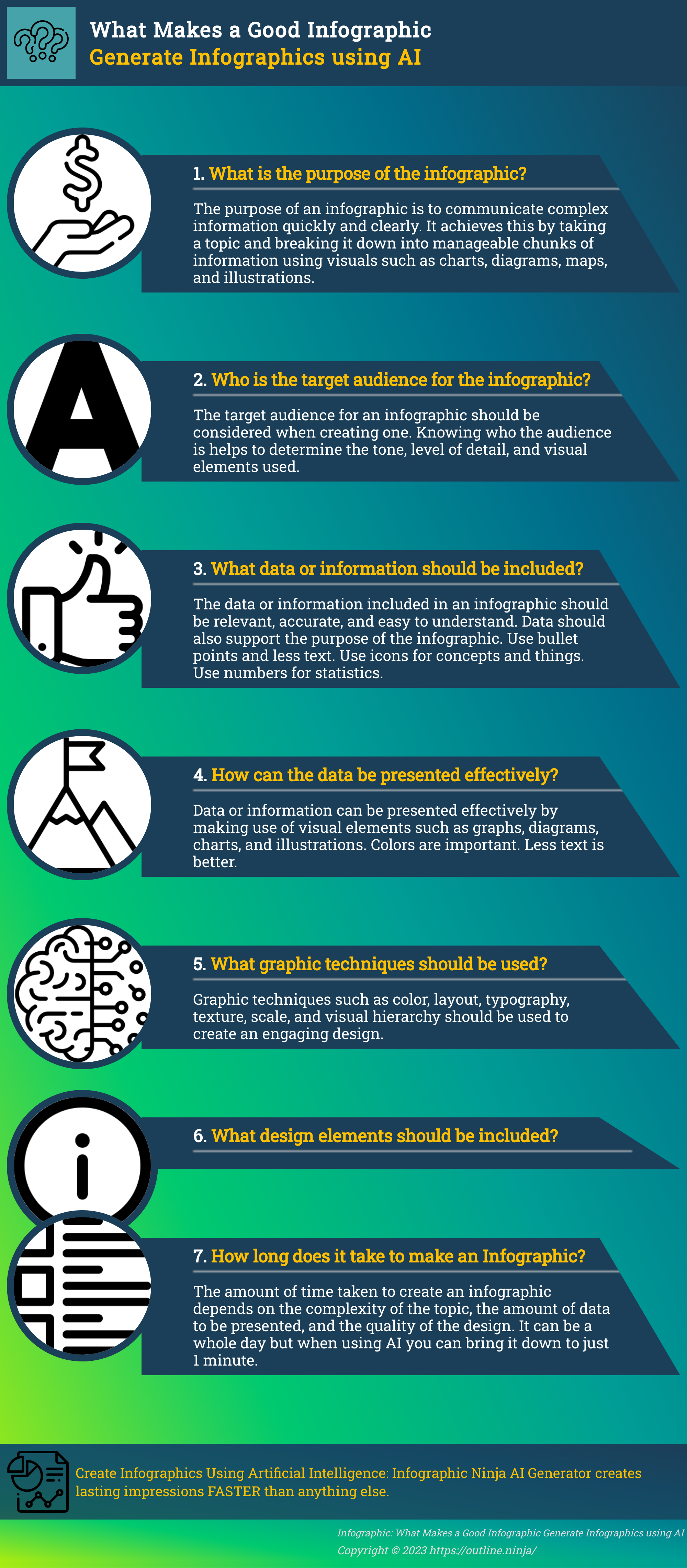
List of things that make a good infographic:
Before you start, consider how much time you have. If you have 30 minutes or 3 minutes that will make big difference in the choice of tools you need to get a quality Infographic.
Time constrained? try our AI Infographic Generator from Text.
1. Begin with a clear objective: Define the purpose of your infographic and identify the key message you want to convey.
2. Simplify complex data: Present information in a simplified and easily digestible format, using charts, graphs, or diagrams to clarify complex data.
3. Use a cohesive color scheme: Choose a color palette that complements your content and enhances readability. Avoid using too many colors that can overwhelm the viewer.
4. Pay attention to typography: Select easy-to-read fonts that are legible even at smaller sizes. Use font sizes, styles, and weights to emphasize important points.
5. Create a logical flow: Arrange your information in a logical order, guiding the viewer’s eye from one section to another smoothly.
6. Add visual elements: Incorporate relevant and visually appealing images, icons, or illustrations that enhance the understanding of your content.
7. Keep it concise: Use concise and impactful language to convey your message. Avoid lengthy paragraphs or excessive text that could overwhelm your audience.
8. Maintain consistency: Ensure consistency in font styles, color choices, and overall visual elements throughout the infographic.
9. Include data sources: Cite your data sources to establish credibility and provide transparency to your audience.
10. Optimize for sharing: Design your infographic with sharing in mind, considering the dimensions and file size suitable for different platforms and devices.
11. Test for readability: Before finalizing your design, test your infographic on different devices and screen sizes to ensure optimal readability.
12. Incorporate white space: Use ample white space to give your infographic a clean and uncluttered look, allowing the viewer to focus on the content.
13. Seek feedback: Share your infographic with others and gather feedback to improve its design and effectiveness.
Key Takeaways of this article:
- Define a clear objective for your infographic.
- Simplify complex data using charts and graphs.
- Choose a cohesive color scheme and legible typography.
- Create a logical flow and incorporate visual elements.
- Maintain consistency and include data sources.
Tips for Creating Informative and Readable Infographics
When it comes to creating a good infographic that is both informative and readable, there are a few key considerations to keep in mind. First and foremost, think about the information design of your infographic. This involves organizing your content in a logical and cohesive manner, ensuring that the flow of information is easy to follow. Use headings and subheadings to break up the content and guide the reader through the infographic.
Another important aspect of creating an effective infographic is the color scheme. Choose colors that are visually appealing and complement each other well. Consider the emotions and associations that different colors evoke, and use this knowledge to your advantage. For example, blue is often associated with trust and stability, while yellow can signify optimism and energy. Experiment with different color combinations to find the right balance for your infographic.
When it comes to typography, it’s crucial to choose fonts that are easy to read at various sizes. Avoid using decorative or overly elaborate fonts, as they can be difficult to decipher. Stick to clear and legible fonts that enhance the readability of your infographic. Additionally, use font sizes and styles to emphasize key points and important information. This will help guide the reader’s attention and make your infographic more engaging.
| Infographic Design Tips | Infographic Best Practices |
|---|---|
| Organize content logically | Choose a visually appealing color scheme |
| Use headings and subheadings | Select fonts that are easy to read |
| Balance text and visuals | Emphasize key points with font size and style |
In summary, creating informative and readable infographics involves thoughtful consideration of information design, color scheme, and typography. By implementing these tips and best practices, you can ensure that your infographic effectively communicates your message and engages your audience.
How to Make a Good Infographic – Ultimate Checklist
- Choose Your Topic:
- Strong, unique, and relevant topic is essential.
- Consider annual reports, survey results, or timelines.
- Utilize pre-designed templates to save time and ensure relevance.
- Select an Effective Layout:
- Balance text and visuals based on your content.
- Text-heavy for detailed information, graphic-heavy for data representation.
- Use templates for layout guidance tailored to your content.
- Organize Content with Visual Hierarchy:
- Arrange information by importance.
- Larger visual elements attract more attention.
- Clear hierarchy ensures key messages are highlighted.
- Design Graphics:
- Choose from various graphic elements like illustrations, charts, and icons.
- Align graphics with brand, audience, and content.
- Consider using templates with suitable graphics for efficiency.
- Choose a Color Palette:
- Understand color psychology for emotional impact.
- Select colors based on the desired audience response.
- Follow the “Goldilocks rule” with three to four colors for balance.
- Select Appropriate Fonts:
- Fonts should align with overall messaging.
- Consider the tone and purpose of the infographic.
Common Mistakes to Avoid in Infographic Design
When it comes to designing infographics, there are several common mistakes that can detract from their effectiveness. To ensure your infographic stands out and effectively communicates your message, here are some key mistakes to avoid:
1. Overloading with Information
A common mistake is trying to include too much information in a single infographic. While it’s important to provide valuable insights, overwhelming your audience with an excessive amount of data can lead to confusion and disengagement. Keep your infographic focused and concise, highlighting only the most relevant information.
2. Neglecting Typography
Typography plays a crucial role in infographic design. Avoid using fonts that are difficult to read or too small, as this can make it challenging for viewers to understand your message. Choose fonts that are legible and appropriate for the content, ensuring that headings, subheadings, and body text are clearly differentiated.
3. Poor Layout and Organization
The layout and organization of your infographic are essential for guiding the viewer’s eye and conveying information effectively. Avoid cluttered designs and chaotic arrangements that make it difficult to follow the flow of information. Instead, use a clear hierarchy, logical sequencing, and ample whitespace to create a visually appealing and easy-to-navigate infographic.
4. Lack of Visual Appeal
An infographic should be visually engaging and aesthetically pleasing to capture and hold the viewer’s attention. Avoid using generic or low-quality visuals, as they can diminish the impact of your infographic. Instead, incorporate relevant and high-quality images, icons, and illustrations that enhance the overall visual appeal and support the message you’re conveying.
5. Inadequate Data Visualization
The purpose of an infographic is to present data in a visual and digestible format. Failing to effectively visualize your data can make it challenging for viewers to understand and interpret the information. Utilize appropriate charts, graphs, and diagrams to illustrate your data in a clear and meaningful way, making it easier for viewers to grasp the key insights.
6. Lack of Credible Sources
One of the hallmarks of a quality infographic is the inclusion of credible sources to back up the information presented. Always ensure that you provide accurate and reliable sources for the data and statistics used in your infographic. This not only adds credibility to your content but also allows viewers to verify the information for themselves.
Avoiding these common mistakes will help you create infographics that effectively convey your message, engage your audience, and provide valuable insights in a visually compelling manner.
Lets recap: Keys to Creating a Good Infographic
When it comes to creating a good infographic, there are a few key elements you need to focus on. By following these tips and avoiding common mistakes, you can design a compelling infographic that effectively communicates your message.
1. Infographic Design Tips
Start by considering the purpose and audience of your infographic. What information do you want to convey, and who are you trying to reach? Keep your design clean and uncluttered, using visuals and icons to enhance understanding. Remember, less is more when it comes to infographics.
2. Infographic Colors
Choosing the right colors for your infographic is crucial. Use a complementary color scheme that helps convey your message and creates visual harmony. Avoid using too many colors, as it can be overwhelming and distracting. Stick to a limited color palette for a cohesive and visually pleasing design.
3. Typography in Infographics
Selecting the right fonts for your infographic is essential for readability. Use fonts that are clear and legible, even at small sizes. Consider using different font weights or styles to create visual hierarchy and guide the reader’s eye. Avoid using too many font styles, as it can make your infographic look cluttered.
4. Common Mistakes to Avoid when creating infographics
While designing your infographic, be mindful of common mistakes that can diminish its impact. Avoid using too much text and strive for concise and to-the-point information. Don’t overcrowd your design with too many visuals or icons, as it can confuse the reader. Finally, double-check for grammar and spelling errors to maintain professionalism.
By focusing on these design tips, selecting the right colors and typography, and steering clear of common mistakes, you can create a well-crafted and visually appealing infographic that effectively communicates your message to your target audience.
Infographic #AI #generator #automated #infographicsGenerator #ArtificialIntelligence #design #best #tips #checklist
FAQ
What makes a good infographic?
A good infographic is one that effectively presents information in a condensed and highly visual way. It should be visually appealing, easy to read, and informative.
What are some tips for creating informative and readable infographics?
When designing infographics, it is important to consider the color scheme, use clear and legible fonts, and organize information in a logical flow. Additionally, incorporating visual elements such as graphs, charts, and icons can enhance readability.
What are common mistakes to avoid in infographic design?
Some common mistakes to avoid include using too much text, overcrowding the design, choosing ineffective color combinations, and neglecting to properly cite sources. It is also important to ensure that the infographic is visually balanced and visually coherent.
What are the key elements to focus on when creating a good infographic?
When creating a good infographic, it is important to focus on elements such as clear hierarchy, visual storytelling, use of data-driven visuals, simplicity, and proper use of typography. These elements help to create a visually appealing and engaging infographic.
What Makes an infographic go Viral?
Analogy:
Creating a good infographic is like crafting a well-designed roadmap for a journey. Just as a map should guide travelers efficiently with clear landmarks and directions, an infographic should lead viewers through information seamlessly. Consider the following elements in this analogy:
- Destination (Main Message): Clearly define your destination or main message. Just as a journey has a purpose, your infographic should have a central idea or message that you want your audience to grasp.
- Landmarks (Key Points): Identify the key points or landmarks along the way. These are the essential pieces of information that support your main message. Just as landmarks help travelers know they are on the right path, key points should reinforce the main idea.
- Pathways (Flow and Structure): Establish logical pathways and connections between landmarks. Similar to well-connected roads on a map, your infographic should have a smooth flow that guides the viewer from one point to the next, ensuring a coherent and easy-to-follow structure.
- Signposts (Headings and Labels): Use clear signposts, such as headings and labels, to guide the viewer. Signposts on a map indicate directions; similarly, headings and labels in an infographic help users understand the content and navigate through it.
- Visual Appeal (Aesthetics): Just as a beautifully illustrated map can make a journey more enjoyable, an aesthetically pleasing infographic captures attention and enhances the overall experience. Choose colors, fonts, and graphics that align with your message and engage your audience.
- Simplicity (Clarity): A cluttered map can confuse travelers. Similarly, an overcrowded infographic can overwhelm viewers. Keep it simple, focusing on conveying your message concisely and clearly. Avoid unnecessary details that might distract from the main points.
- Consistency (Design Cohesion): Maintain consistency in design elements. Like a well-designed map with a cohesive visual style, an infographic should have a uniform design theme to create a professional and polished look.
- Audience Consideration (User-Friendly): Consider your audience’s needs and preferences. Just as a good map caters to the needs of travelers, an effective infographic should be user-friendly and resonate with your target audience.
Conclusion
By envisioning your infographic as a roadmap, you can better plan and execute a visual representation of information that is not only informative but also visually appealing and easy to navigate.
Creating high-quality infographics is essential for businesses as they play a pivotal role in bolstering brand awareness. Skillfully designed infographics with good attributes possess the ability to captivate the audience with narrative, leaving a lasting impression on their minds.
It’s not merely about showcasing data; it’s about telling a compelling narrative that resonates with the viewers. A well-crafted infographic addresses a problem or a concept, guiding the audience through a visual representation of the solution or process. Thorough research is the foundation, ensuring accuracy and credibility.
Infographic design skills come into play, employing aesthetics, color schemes, and layouts that not only enhance visual appeal but also contribute to a seamless user experience. Incorporating user experience tricks ensures that the audience not only understands the content but enjoys the journey of exploration, establishing a connection between the brand and the viewer.
In essence, a good infographic goes beyond information presentation; it becomes a powerful tool for communication and engagement.